Top News
Your morning climate cult update: We’re all still gonna die fiery deaths

There was a thang this weekend that got me going. Especially after news broadcast openings using foghorns alerting viewers about this UNEXPECTED SCOURGE OF BLAZING HEAT (aka “summer”) blanketing the country, while attempting to panic the entire populace.
So, anyway, I read this hysterical – in the “ZOMG!” sense – tweet…
…and once my eyes rolled forward from the back of my head where I could use them again, I zeroed in on two things.
1) It’s hot and humid in Miami in the summer. This is revelation to the lad, however exciting? We lived there for years, went back for visits, and (before the age of ramps, planes had stairs rolled out to them like the ones POTATUS stumbles up) every time you got to the aircraft door, that wet Miami air hit you in the face like a mugging. I suppose he either doesn’t follow basketball, or thought the “Miami Heat” name referred to just the pace of play on the court.
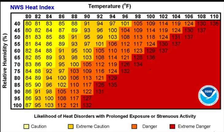
2) Heat index record was SMASHED Now…hmm. I don’t know about you, but I wasn’t aware we were keeping “heat index records.” And what would “smashing the old record” of a heat index mean in any event, as the heat index wasn’t even invented until 1979.
Yes, that’s correct. And the heat index didn’t come into general use until the early 1980’s, replacing the Temperature-Humidity Index (THI), which hadn’t been as reliable.

So what does Henny Penny’s smashed record even mean? Not much, because there’s about bupkiss historical data behind it to correlate to.
That message is being carried by the MSM to the masses.
I do know that the broadcast news has switched during this current warm spell to using heat indexes. They’ve also sort of been downplaying the fact that it’s those hotter heat indices temps on the map they’re giving the viewer as opposed to the actual temperatures.
One reason could be, as our son Ebola the Air Force’s finest meteorologist says:
Index is smart, if your intent is to not have heat casualties.
Another reason, and the one my very cynical nature leans to, is that the values are higher, so the climate cultists can make the map much redder and scarier.
OMG! The Oceans are on fire and half of America is pink hot.#ClimateNonsense #ClimateScam pic.twitter.com/tcZ1ZfPhxO
— David Kurten (@davidkurten) July 20, 2023
Gets the message across better when it’s all ablaze, no?
Except, like…it’s not. It’s summer and it’s hot.
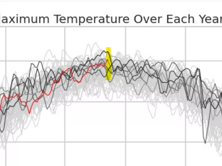
Through July 23, 2023, how are Lower 48 USA temperatures (area averaged) compared to last 70+ years?

The red line tracks this year’s progress.
So far, nothing exceptional across the United States: middle of the pack.
While global ocean temperatures have run much… pic.twitter.com/LqoHZu2FZy
— Ryan Maue (@RyanMaue) July 24, 2023
But it’s not even remotely THE HOTTEST in the past 70 years, less mind the last 12,000 or whatever they’re attempting to claim.

It’s SMASHING great for headlines and the narrative…as long as no one thinks to ask any questions. When they do, historical data leads them to shift yet again.

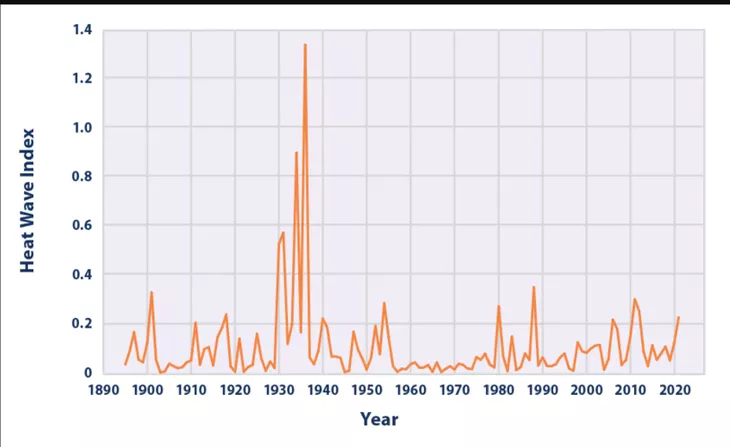
By “shift again” I mean change to graph to scarier. The graph above (Titled: U.S. Annual Heat Wave Index 1895-2020 Figure 3) was formerly on the EPA’s page and contains the historical data on heatwaves. It was accompanied by this paragraph:
…“Longer term records show that heat waves in 1930s remain the most severe in recorded U.S. history (see Figure 3). The spike in Figure 3 reflects extreme, persistent heat waves in the Great Plains region during a period known as the “Dust Bowl.” Poor land use practices and many years of intense drought contributed to these heat waves by depleting moisture and reducing the moderating effects of evaporation.”
Fast forward to the Biden administration taking over, and the rejiggering began.
…EPA changed its Climate Change Indicators page for Heat Waves after Biden and the climate alarmist Democrats took power in 2020 with the new manufactured alarmist graphics trying to portray increasing heat waves while concealing the “gold standard” Heat Wave Index as shown below.
…The “gold standard” measured data representing the prior 125 year period of U.S. heat wave occurrences and intensity was hidden in a tiny thumbnail size Figure 3 in the lower right corner and replaced with a page providing politically driven increasing heat wave climate alarmist deceptive graphics that excluded the period prior to 1960 thus removing over 60+ years of measured heat wave data from view (Joseph Stalin era disappearing act) as summarized below.
These people are manipulative fraud all the way down. Science™ my asterisk.
Despite ‘hottest days ever’ nonsense, Death Valley has yet to break its record of 134°F set in 1934.https://t.co/ddTPCL0cnR
— Steve Milloy (@JunkScience) July 24, 2023
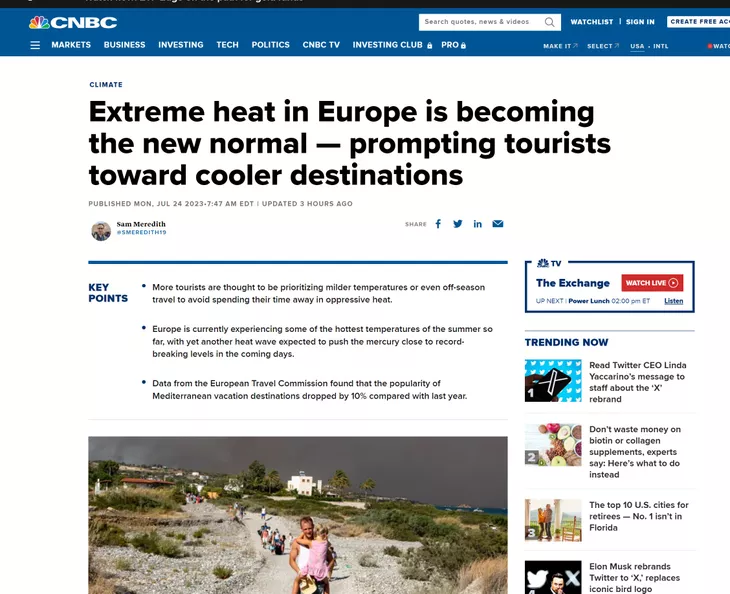
In Europe, CNBC’s headline would have you believe the entire continent is broiling into smoke and ashes…

…when, in fact, Ebola is sitting in a sweater in his house in Germany and the British open this past weekend looked like this.
Why Hasn’t The British Open Ever Been Played in Wales? [ad_1]
The rain rat-a-tatted atop the umbrellas around Royal Liverpool Golf Club’s 17th green one afternoon this past week, the air so chilled that it did not feel like even an English summer. A veil of mist clouded the … pic.twitter.com/fzoA5gElPQ
— alriyaan (@alriyaan009) July 23, 2023
Now, there is no denying it’s 1) summer 2) and really, REALLY hot in some places.
Everyone should take the proper precautions as well as watch out for their fellow man: check on elderly folks you know, don’t mow the lawn in the heat of the day, leave babies or pets locked up in blistering vehicles in parking lots, ad nauseum. Hydration is key, but more so is common sense, and that is so lacking lately.
As for the climate cultists shrieking every night on the news?
They can just chili out.
It’s still gonna be hot tamale.
Read the full article here

-
Uncategorized6 days ago
The Surge of Crypto Slots: A New Period in Online Pc Gaming
-
Uncategorized7 days ago
Kəşf Etmək Binance Coin Kazino Saytları Dünyasını
-
Uncategorized7 days ago
The Increase of Dogecoin Casino Sites: An Extensive Introduction
-
Uncategorized6 days ago
High Roller Online Casinos: Inside the Globe of Elite Betting
-
Uncategorized2 days ago
The Comprehensive Overview to Tutoring Networks


